When a coach picks coaching software, they judge the dashboard. When a client decides whether to keep paying, they judge the app. The two judgements look nothing alike, and the second one is the one nobody walks you through before you sign up.
This page covers the client's view from the first log-in to the weekly check-in, what changes when you brand the app, and the exact message to send a client before they open it for the first time. The honest version is stated up front and it comes back in the FAQ: a client who will not use the app at all is usually a coaching problem, not a software problem.
Quick answer
A coaching app shows the client three things once they are in: their program, their tasks for today, and their check-in prompts. No app store download, no card, and no pricing page, on any plan. On Pro the same app carries the coach's name, logo and colours instead of the platform's.
Why the client side decides retention
A coach can love a dashboard and still lose clients to an app that confuses. The client never sees the client list, the automation, or the reporting the coach chose the software for. They see the program, the tasks, the check-in, and whether all of it works on a phone at 6am.
Retention is decided early, and the app carries the early experience. In the first fortnight a client has no results to judge you on, so they judge the only evidence they have: how fast things arrived, how clear the instructions were, and whether anyone seemed to notice. Our client onboarding guide lays out the full fourteen-day timeline, and the app does the heavy lifting in days one and two.
The failure mode is easy to recognise once you have seen the numbers behind it. A client managing a program PDF, a messaging thread and a spreadsheet has three places to get lost before they have trained once. Each extra surface is a small chance they stop coming back, and the app exists to collapse them all into one.
The first-run experience: what a new client sees
There is no app store in the first-run experience, and that is the first thing a client notices. The coaching app is a browser-based app. The coach sends a link, the client opens it on their phone, taps Add to Home Screen, and it behaves like a native app in about thirty seconds on both iPhone and Android. No downloads, no logins to a separate store, no waiting for approval.
What the client actually lands on matters more than the install. The first screen shows their own plan, not a feature tour. There is no pricing page and no billing section on the client side. Clients never enter a card on any plan, which means the first-run message can say what it should say: this is a change on your end, not a bill on theirs. The invitation message that gets a client to open the link in the first place is covered in our guide to moving clients into coaching software.
The first-run moment is fragile, and most coaches know it. The fix is a two-minute screen recording, filmed once, showing where the program lives, how to mark a workout done and where to message the coach. Send the same video to every new client. Clients who watch it are the ones still opening the app in week four.
The daily view: today's session, tasks, and the plan
Once a client is in, the daily view is deliberately thin. The app shows the day's tasks, the program, and the check-in prompts that are due. Thin is the design goal here, not a limit. A client who opens the app at 5:55am and meets yesterday's session, a leaderboard and a settings maze is a client who closes it again.
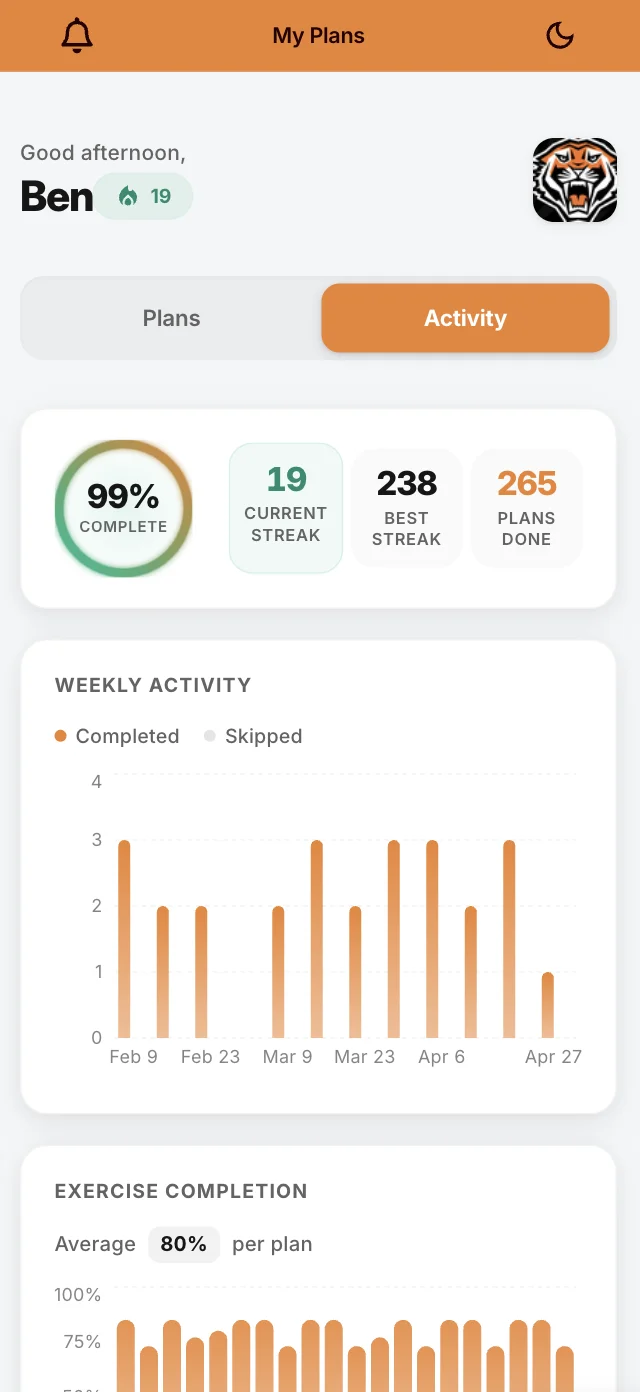
The program is the centre of that screen. The day's workout sits there, each task marked off as it is done, with the full plan below it and the history building as the weeks stack up. When a client marks a workout complete, the coach sees it. When they have a question, they message from inside the same app rather than firing up WhatsApp.
Habits sit on the same screen when they are assigned. Water, protein, steps, a handful of daily targets with a one-tap Complete button each. The habit layer is the lowest-friction version of the check-in that exists, a tap rather than a form, and the shape of that data over weeks is the subject of our guide to habit check-ins.
Two extras change the daily view on Pro without crowding it. Pro adds an activity view where the client sees their own completion rate, streaks and training history, and nutrition adds a Food Diary where meals land next to the training. The full feature list, including what sits on each tier, is on the Pro features and pricing guide. This page is the walkthrough of what the client actually sees, and nobody wants a walkthrough of every button in one article.
The check-in from the client's side
The check-in, from the client's side, is a short form that arrives on a schedule. Weekly for the routine pulse, a deeper version monthly. It takes about five minutes, and the whole thing lives in the app rather than in a message thread that gets buried under memes and parcels. The cadence and the question design that make clients keep answering are covered in our guide to online client check-ins.
What the client fills in depends on the training. For body-change and physique work, the check-in holds progress photos and weight alongside the questions, with the full history kept rather than just the latest week. The prep version of that ritual, photo protocol and all, is our guide to physique prep weekly check-ins. For everyone else, the check-in is the questions and the habit log.
The record is part of the coaching. A client who can open the app and scroll from week one to now sees progress they would otherwise have to trust you on. That visible record is what turns a check-in from an interruption into the reason the client stays.
Branded app vs plain app: what changes
On the free tier the client app carries QuickCoach's name and branding. On Pro the same app carries the coach's. The icon on the home screen shows the coach's logo and business name, the splash screen matches, and the colours inside the app follow the brand. From the client's seat it feels like the coach had the app built, because the coach, in a real sense, did. The setup takes about five minutes and the walkthrough of it is on our custom branded coaching app guide.
The honest line saves a lot of money and confusion. A custom-branded app means your name and colours on an app you did not build. It is not a full white-label listing in the app stores under your own business name, and the difference between the two decides the cost.
What branding does not change is the client's daily experience of the core app. The program, the tasks and the check-ins work the same on the branded app and the plain app, because they are the same app. Branding is the wrapper, and the wrapper matters most once the client already likes what is inside. Upgrade when the brand starts doing selling work for you, not before.
Pro also unlocks push notifications, so time-sensitive notes and reminders reach the client's phone rather than waiting for the next open of the app. That is a real retention tool, and it is the sort of thing to weigh against the flat Pro price in the guide above.
What to tell a client before they log in
Most first-log-in confusion is preventable, and prevention is a short message, not a manual. Send this before the client opens the app, so the first-run screen confirms what they were told rather than introducing it.
Copy-paste pre-login message
Before you log in, here's what's waiting: your program, your check-ins and our messages all live in this app. I update your plan there, so check it on training days. When a check-in lands it takes about five minutes. If anything looks wrong or you can't find something, message me from inside the app and I'll sort it. Open the link and tap Add to Home Screen, and you're in.
CopiedThree things make it work. It names what is inside, so the client does not hunt for features that were never promised. It sets the rhythm, the check-in that arrives and takes five minutes. And it gives the fallback, message from inside the app, so a stuck client has one obvious next step instead of abandoning the whole thing.
And the honest limit, stated plainly. A client who refuses the app entirely is not a software failure, and forcing it does not fix the relationship. Keep them on the channel they prefer for a defined window, keep coaching, and show them their plan once. Most come across within a fortnight once they see their program in one place.
Frequently Asked Questions
Do clients need to download an app?
No. The client app installs straight from the browser. On a phone, the client opens the link, taps Add to Home Screen, and gets an app icon without visiting the App Store or Google Play. The same flow works on iPhone and Android.
What if a client will not use the app?
Treat it as a coaching conversation, not a software failure. Keep the client on the channel they prefer for a defined window, keep coaching, and show them their plan inside the app once. Most clients come across within a fortnight once they see their program in one place. The relationship outranks the tool.
Can clients see each other?
No. Each client has their own account and sees only their own program, tasks, check-ins and history. There is no client directory and no social feed, and no client can see who else you coach or how anyone else is tracking.
Published September 2026. This page sits in the coaching guides hub alongside the onboarding timeline, the check-in system and the branded app guides it links to. If you are comparing platforms on the client experience, the honest test is to open an account and walk it from a client's phone. QuickCoach's free tier holds up to 20 clients with no time limit, the client app is free for clients on every plan, and branding the app as yours is core to Pro at $39 a month, or $32.50 a month on annual billing. No separate per-client fee, and no card for clients.