Ask a coach what branding means and you get a logo, a website and an Instagram grid. That is the wrong frame, and it is why so much branding advice is useless to a working coach. A logo on nothing is a picture. A website nobody visits is a billboard on an empty road. The brand that actually works is the one the client touches, and a coach's clients touch the software, the email and the plan long before they ever see a logo.
This page is the order of operations. It is written for coaches who have been told to build a brand and have no idea where to start, and it answers the question in the title: what to brand first. The short version is a ladder, and the rungs are set by how often a client touches each thing. Brand the daily touchpoint before the weekly one, the weekly one before the occasional one, and the occasional one before the decorative one.
Quick answer
A coaching brand is the sum of the touchpoints a client actually touches, in order of frequency. Brand the client app first, then the welcome email, then the plan and printouts, then your social identity, then physical products. A logo alone does nothing, and the first three steps are part of the software, not a design project.
Why "branding" scares coaches (and why it should not)
Branding scares coaches because it sounds like a design project with a designer's bill attached. The word conjures mood boards, font pairings and a logo redesign that costs more than a month of coaching income. None of that is what a working coach needs, and none of it is what branding means in practice.
In practice, branding is the answer to one question: when a client or a potential client encounters your business, what do they consistently see and feel? The answer is built from small, repeatable things. The app they open has your name on it. The email that welcomes them sounds like you. The plan they follow looks like it came from you. Consistency across those small things is the entire job, and it does not require a designer.
The reason this matters more now than it used to is that the client experience has moved online. A coach who delivers programs through software has a branded surface in front of every client every day, whether they use it or not. The choice is not whether to have a brand. It is whether the brand is deliberate or accidental.
What a coaching brand actually is: the client experience
A coaching brand is not the logo. It is the accumulated impression of every interaction a client has with your business, and for an online coach those interactions are mostly digital. The app, the email, the plan, the check-in, the reply. Each one is a touchpoint, and each one either reinforces the same identity or dilutes it.
Think about what a client actually experiences in a month. They open the app to see their sessions, maybe a dozen times. They read the welcome email once, at the start. They follow the plan you wrote, weekly. They see your social posts occasionally, if they follow you. They might buy a t-shirt once a year, if you sell one. The frequency is not equal, and the branding effort should not be either.
That is the whole framework. Brand the things clients touch most, first. The rest can wait, and some of it can wait forever. The full system for turning a client experience into a working brand is the touchpoint ladder below, and it is the same ladder a Pilates studio uses to carry its identity between sessions, and an independent Pilates instructor uses to build a personal brand without a studio.
The touchpoint ladder: what clients touch, in order
Here is the ladder, ordered by touch frequency. Work down it in order, and do not skip rungs to get to the decorative ones.
Rung one: the client app. The thing clients open most often, and the surface your name appears on daily. This is the branded client app, and it is the first thing to brand.
Rung two: the welcome email. The first impression, and the one that sets the tone for the relationship. It is read once, but it is read first.
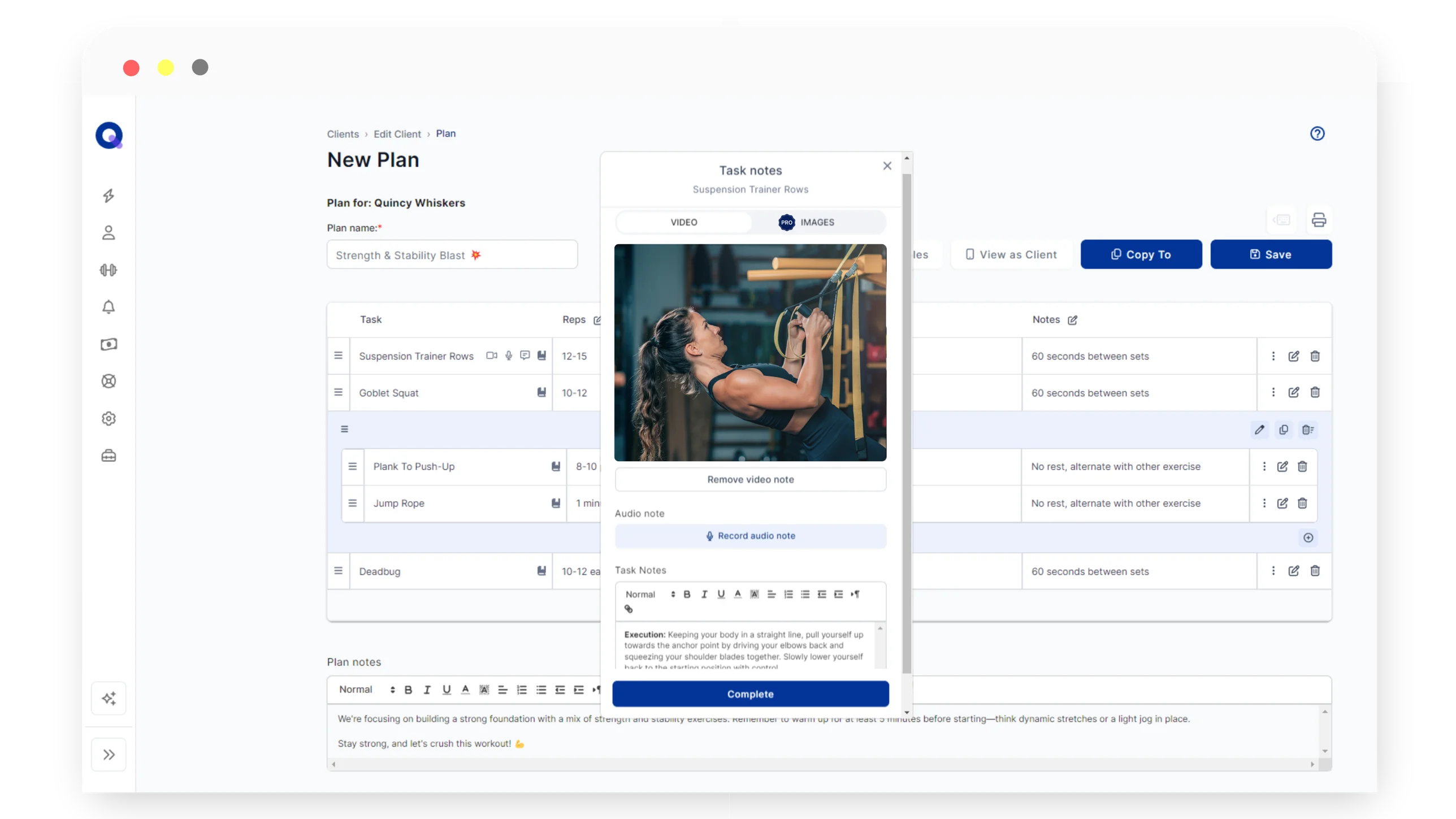
Rung three: the plan and the printouts. The weekly touch. The program you write, the PDF you send, the printed plan for clients who prefer paper. These carry your identity into the client's week.
Rung four: your social identity. Where potential clients find you. This matters for discovery, not for retention, and it should match the identity the app and the email already carry.
Rung five: physical products. The merchandise, the kit, the swag. This is the belonging layer, and it earns its place only after the first four rungs are consistent. A t-shirt with a logo nobody recognises is a t-shirt.
The ladder is the framework, and the rest of this page walks each rung. If you only take one thing from it, take the ordering: the daily touchpoint beats the weekly one, the weekly one beats the occasional one, and the occasional one beats the decorative one.
What to brand first: the client app
The client app is the rung that matters most, because it is the touchpoint with the highest frequency. A client who opens an app with your name, your colours and your logo on it every day is a client who knows whose program they are following. A client who opens a generic app with a vendor's name on it is a client who is not sure who is coaching them.
This is not a theory. The behaviour is visible in the product: more than half of paying QuickCoach coaches upgrade to Pro for the branded client experience while still inside the free tier's 20-client limit. They are not upgrading because they hit a cap. They are upgrading because the branded app changes how their clients see them, and that change is worth the price on its own.
The mechanics are simple. The branded client app puts your logo, your colours and your business name on the app your clients install, so they see your brand instead of ours. The full setup is covered in our guide to creating a custom branded coaching app, and it takes minutes rather than weeks. The app is a Progressive Web App, which means clients install it from the browser with no App Store review, and your branded version is live the moment you set it up.
If you are not ready for Pro yet, the free tier is the honest pilot. It holds up to 20 clients with no time limit, and it lets you build the workflow before you pay for the branding layer. The branded app is the reason to move, and the free tier is the way to test everything else first. The value question, whether the branded app is worth the money, is answered in our guide to whether a branded app lets you charge premium rates.
Second: the welcome email and the first impression
The welcome email is the first thing a new client reads, and it sets the tone for the whole relationship. It is also the easiest touchpoint to brand, because it is a template rather than a design project.
A branded welcome email carries your name, your colours and your voice from the first message. The client has just paid you, or just agreed to start, and the email is the confirmation that they have joined something specific rather than something generic. The difference between a branded welcome and a plain one is the difference between arriving at a studio with your name on the door and arriving at a room with no sign.
The full case for branded coaching emails, and what they signal to clients, is in our guide to why branded coaching emails matter. The short version: the first email is where the client decides whether the service feels professional, and a branded one settles that decision in your favour before the first session.
Third: the plan and the printouts
The plan is the weekly touch, and it is the touchpoint that carries your identity into the client's week. Every session they complete, every check-in they answer, is a moment where your name could be on the thing they are looking at.
Branded plan printouts matter most for the clients who do not live in the app. Some clients want paper, some want a PDF they can print, and some want an email they can forward to a partner or a physio. When those clients see your name and colours on the plan, the brand travels with the program instead of stopping at the app.
The printouts are part of the same Pro package as the branded app and the branded email, which is what makes the first three rungs of the ladder cheap. You are not commissioning three design projects. You are turning on three settings in the same software, and the identity you set once carries across all of them.
Fourth: your social identity
Social media is where potential clients find you, and it is the rung where most coaches start and most coaches stall. The honest position: social is for discovery, not for retention, and it should match the identity the app and the email already carry.
The mistake is treating social as the brand and the client experience as an afterthought. A coach with a polished Instagram and a generic client app has the two-brand problem: the person they present online is not the person the client experiences. The fix is not more posting. It is making the client experience match the online identity, so a follower who becomes a client recognises the product.
If you are building a following, the practical move is to show the work. The sessions, the check-ins, the progress. The app is the bridge between the follower and the client, and the full argument for connecting your social identity to the physical and digital products is in our guide to connecting your social media identity to branded products, and the practical path from a warm audience to a paying roster is in our guide to getting your first online coaching clients. The short version: the brand you build online has to survive contact with the client experience, and the client experience is the app, the email and the plan.
Fifth: physical products, when you are ready
Physical products are the belonging layer, and they earn their place only after the first four rungs are consistent. A t-shirt with a logo nobody recognises is a t-shirt. A singlet that a training club wears together is a belonging signal, and a studio towel that clients actually use is a daily touch. The difference is not the product. It is whether the identity behind it already exists.
The rule for merchandise is the utility test: would a client use this weekly? The things that pass are the things that belong in the training week, the kit, the towel, the bottle, the app. The things that fail are the things that sit in a drawer, the tote bag, the keyring, the mug. The same test governs the whole merchandise category, and it is the framework the branded products in this cluster follow.
When you do get to physical products, keep them consistent with the identity you have already built. The same name, the same colours, the same voice. A client who wears your singlet and opens your app should be looking at the same brand, and that consistency is what turns a purchase into a belonging signal.
The honest version: a logo alone does nothing
Here is the honest version, and it is the version every coach needs to hear before spending money on branding. A logo alone does nothing. A website alone does nothing. An Instagram grid alone does nothing. What works is a consistent client experience, and the logo, the website and the grid are components of that experience, not substitutes for it. The full inventory of those components, the name, the colours, the type, the app, the emails and the one-page note, is in our guide to the fitness coach brand kit.
The order matters because the budget is finite. A coach with a few hundred dollars to spend on branding gets more from a branded client app than from a logo, because the app is touched daily and the logo is seen occasionally. The same money spent in the wrong order buys a picture that nobody looks at.
This is also the position that separates useful branding advice from the decorative kind. The decorative kind sells you the logo. The useful kind sells you the experience, and it tells you to spend on the touchpoints in the order your clients touch them. If you are pricing your coaching and wondering what a premium rate should buy, the branded experience is part of the answer, and the honest version of that argument is in our guide to how much to charge for online coaching.
Frequently Asked Questions
Do I need a logo before anything else?
No. A logo is one component of a brand, and it is not the first one. Brand the touchpoints clients actually use first, starting with the client app, and let the logo follow the identity rather than leading it. A logo on nothing is a picture.
Is a branded app worth it for a small roster?
Yes, and it is the first thing to brand precisely because it is the daily touchpoint. A client who opens an app with your name and colours on it every day feels the brand more than a client who sees a logo once. More than half of paying QuickCoach coaches upgrade to Pro for the branded client experience while still inside the free tier's 20-client limit.
What if I coach under my own name?
Coaching under your own name is a brand, and a strong one. The same rules apply: your name goes on the app, the email and the plan, and the colours and voice stay consistent. A personal name with a consistent client experience beats a business name with none.
How much does branding cost?
The first three steps cost nothing beyond the software. The branded client app, branded welcome email and branded plan printouts are part of QuickCoach Pro at $39 a month, or $32.50 a month effective on annual billing. A logo can cost anything from a few hundred dollars to a few thousand, and it is not the first purchase you should make.
Published August 2026. The touchpoint ladder is the framework behind the whole branding cluster in the coaching guides hub, and it applies to every niche the site covers, from Pilates studios carrying their identity between sessions to independent instructors building a personal brand without a studio. If you are building the client experience from scratch, QuickCoach's free tier holds up to 20 clients with no time limit, and the full Pro breakdown, including the branded client app, branded emails and branded printouts, is on our Pro features and pricing page.